Lifestage Merchandising
Product Design

Project Overview
My Role: Senior Product Designer
Team: Director of Digital, Digital Associate, Development Agency
Needed's catalog spans multiple life stages and the site experience was in need of a refresh for the for the entire user funnel along with new life stage categories.
I was the lead designer working through AB testing, starting the user research program, designing the new components, page redesigns, and development handoff.
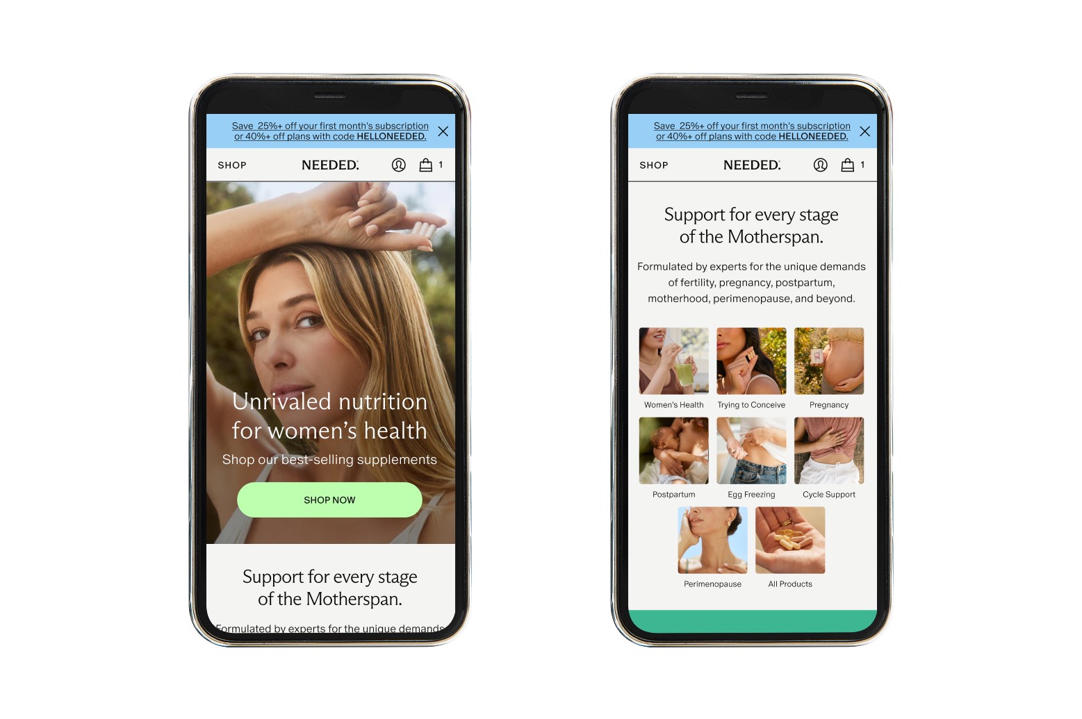
New Designs
Project Goals
How could we optimize the user funnel from homepage, nav to PLP collections, so users could easily find and shop their own life stage?
The previous site needed mobile optimization, PLP had a high bounce rate, and this site wasn't optimized for 7+ life stage categories.
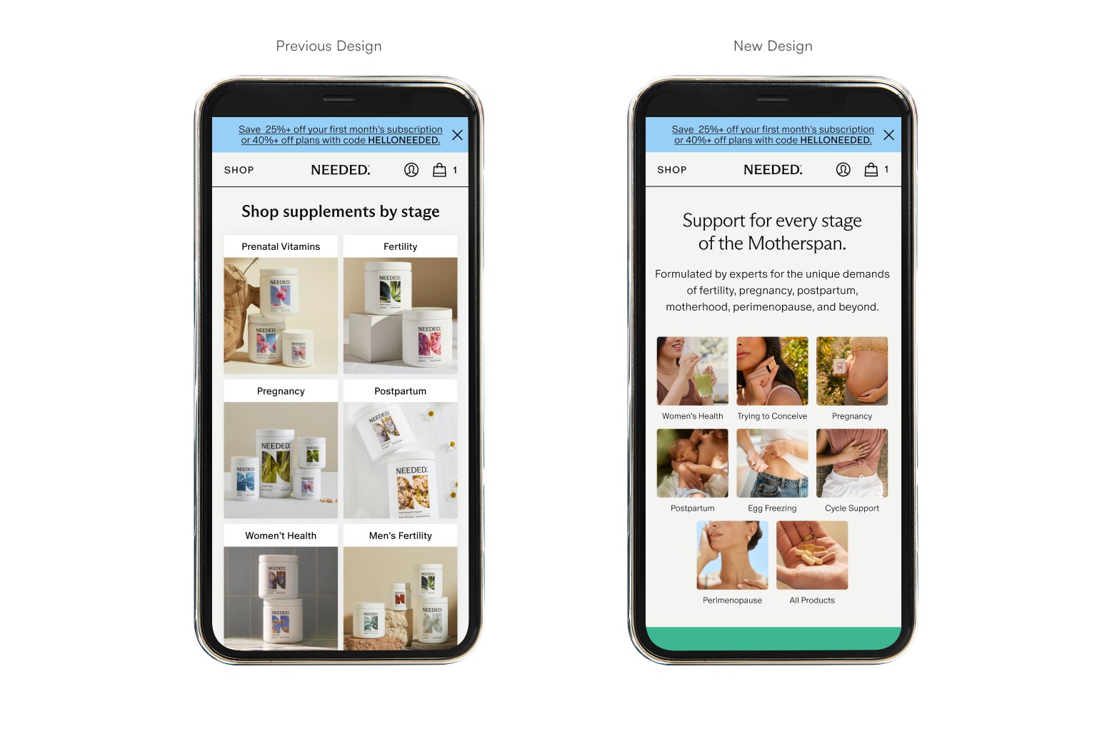
Approach: Data & Design
Rather than starting from a blank slate, our team grounded the redesign with existing signals: heatmaps, past customer research, metrics, and UX best practices. These informed a set of new modules across the site experience from homepage through navigation to PLP.
Homepage CRO
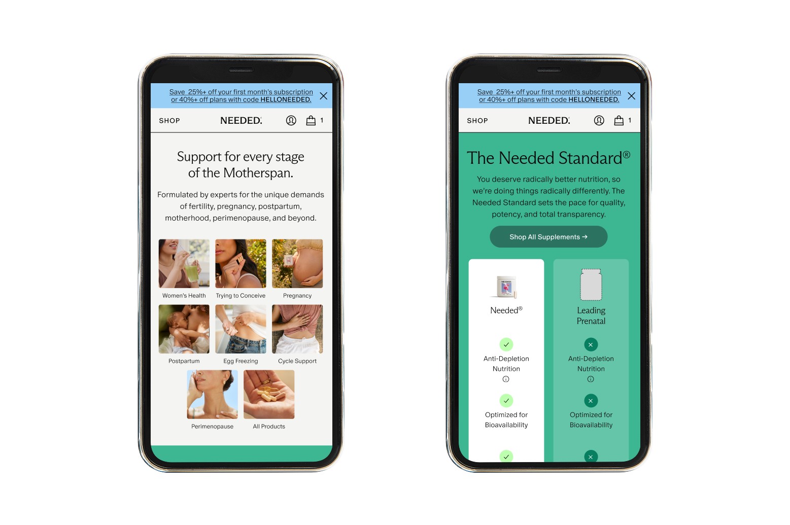
Introduced a new lifestage categories module which became the 2nd-most-clicked element on the homepage, behind the hero CTA. Also added a comparison chart to help users differentiate how Needed leads the industry in clinical standards and nutrients.
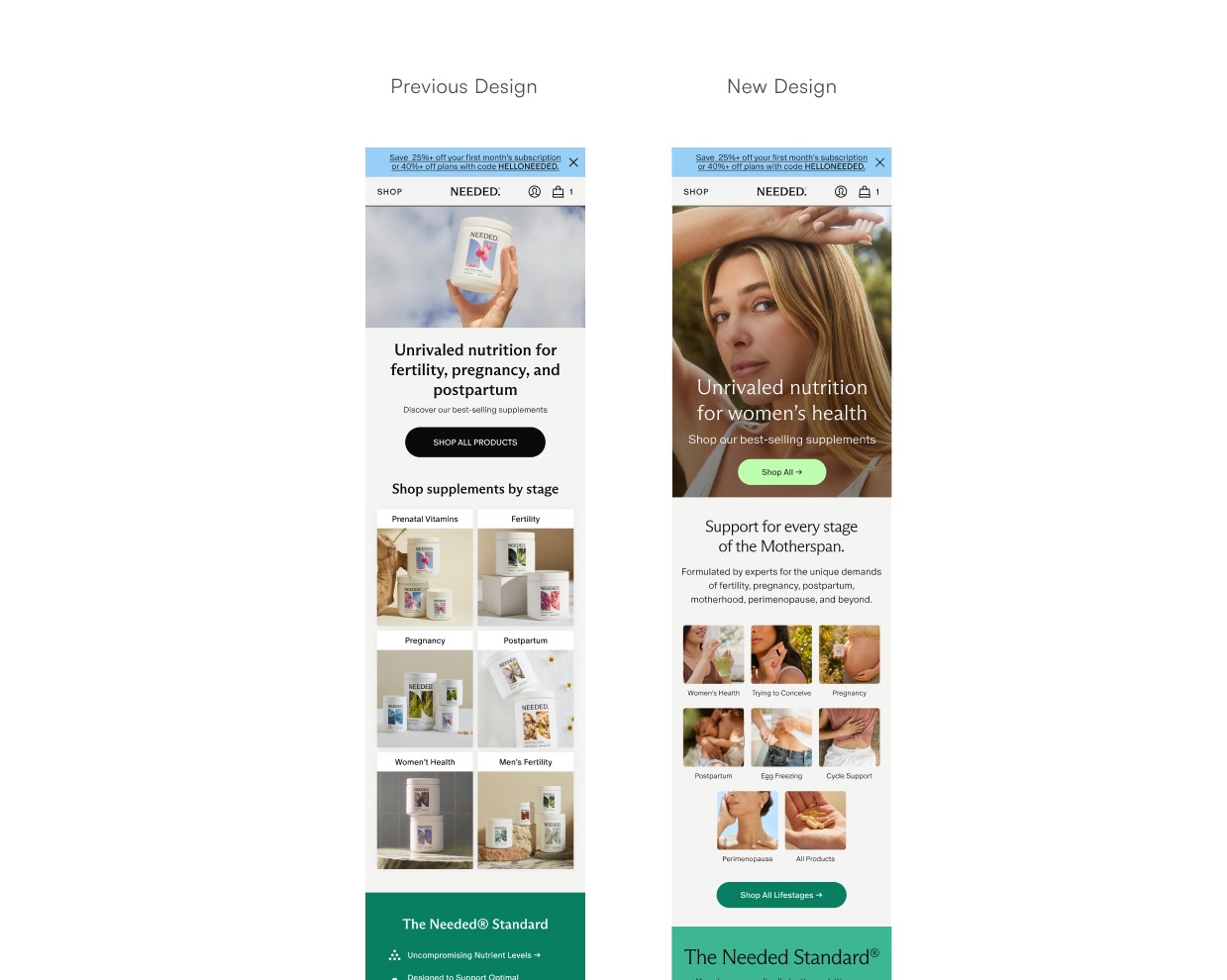
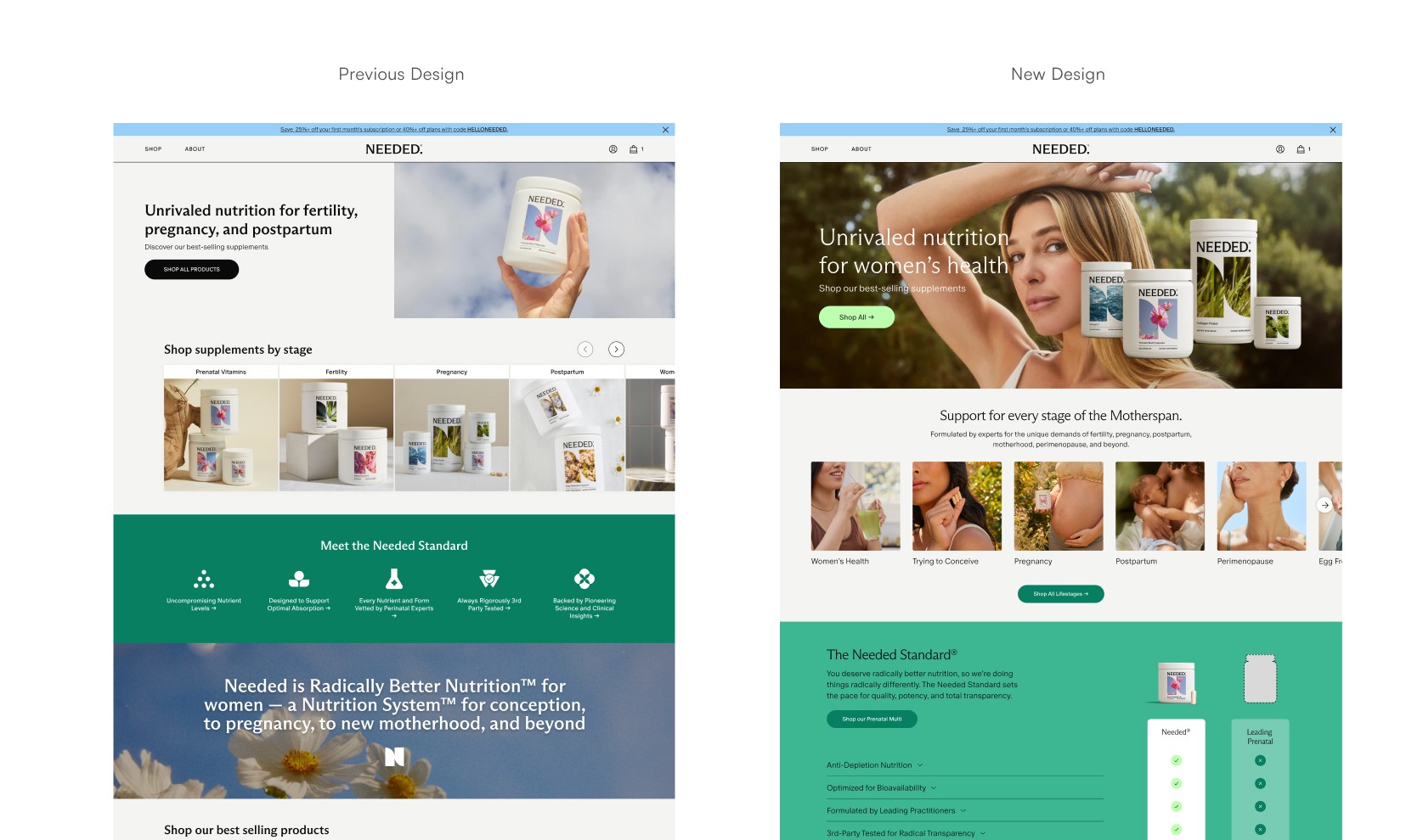
We then tested into a newly built video hero with various features the current hero lacked such as video capabilities, media configuration, various layout, color theme customization, and CTA controls.
We saw standout metrics such in our main numbers and guardrails:
CVR +7.3%, AOV: +3.9%, PSV: +11.5, Revenue: +9.9%
Sneak peek into how I built the hero component in Figma ->
Navigation
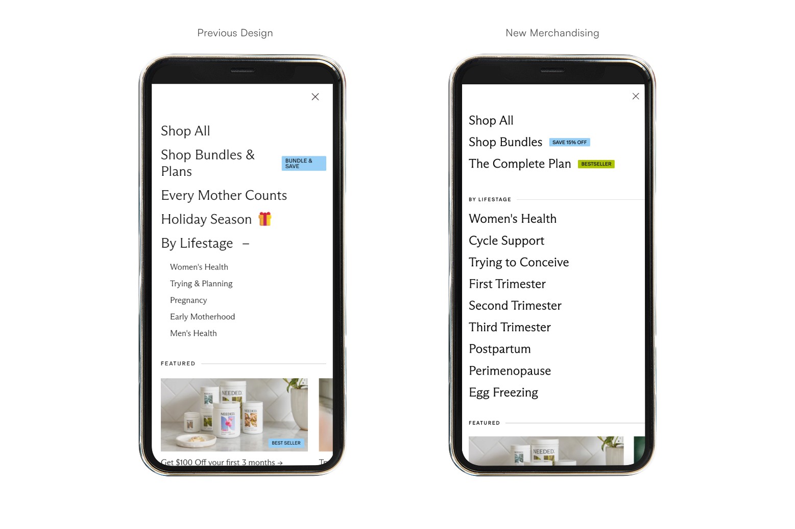
Building on the existing design, our team made merchandising tweaks in Shopify's nav to surface life stages more directly.
Changes reflected 9 categories total which we eventually reduced to 7 life stages after user testing and simplifying the entry points.
PLP CRO & Redesign
Before launching we ran two A/B tests.
First test was control (image header) vs. variant (text header) which resulted in:
CVR +6.43% → +RPV 10.13% → ATC 5.36% with the winning test variant.

The second test was with the Product Cards CTA in an ABC test with new button styling. → 9.6% CVR → 9.84% RPV → 4.13% ATC rate with test B variant winning
Both of these tests informed our new redesign with new collection headers, new product cards, new features like desktop/mobile filtering, and an overhaul of all the life-stage collections.
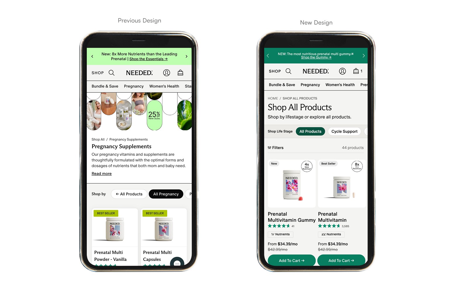
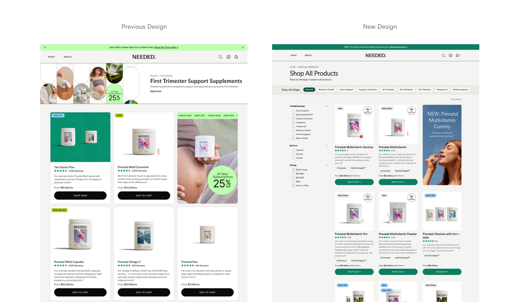
Built for scalability, we included features to future-proof the PLP. In this prototype example we can add gallery images with a hover functionality on desktop and carousel on mobile. There's also the ability to use image-based links.
User Research
After these updates we tested the full path of users landing on the homepage, shopping, and arriving at the PDP to validate whether the new experience actually helped people self-identify and shop their life stage.
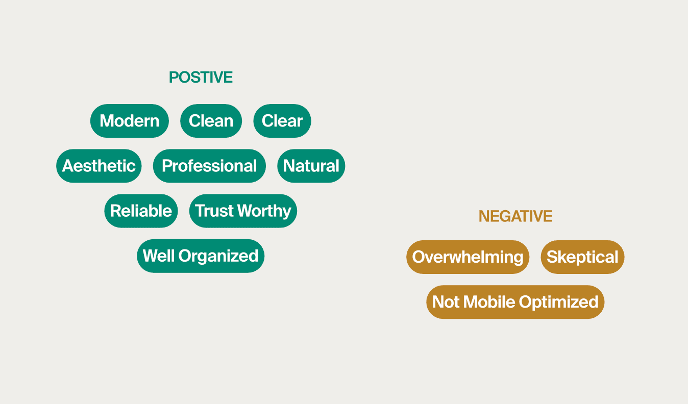
80% of users had a positive impression of the brand.
Users understood what the brand sells and target audience right away.
40% of users interacted with the classic hamburger menu, they
praised it’s ease of use and the clear categorizations.
Mobile optimization on the PDP was clear pain point from the old PDP design template, prior to my arrival along with some overwhelm and skepticism.
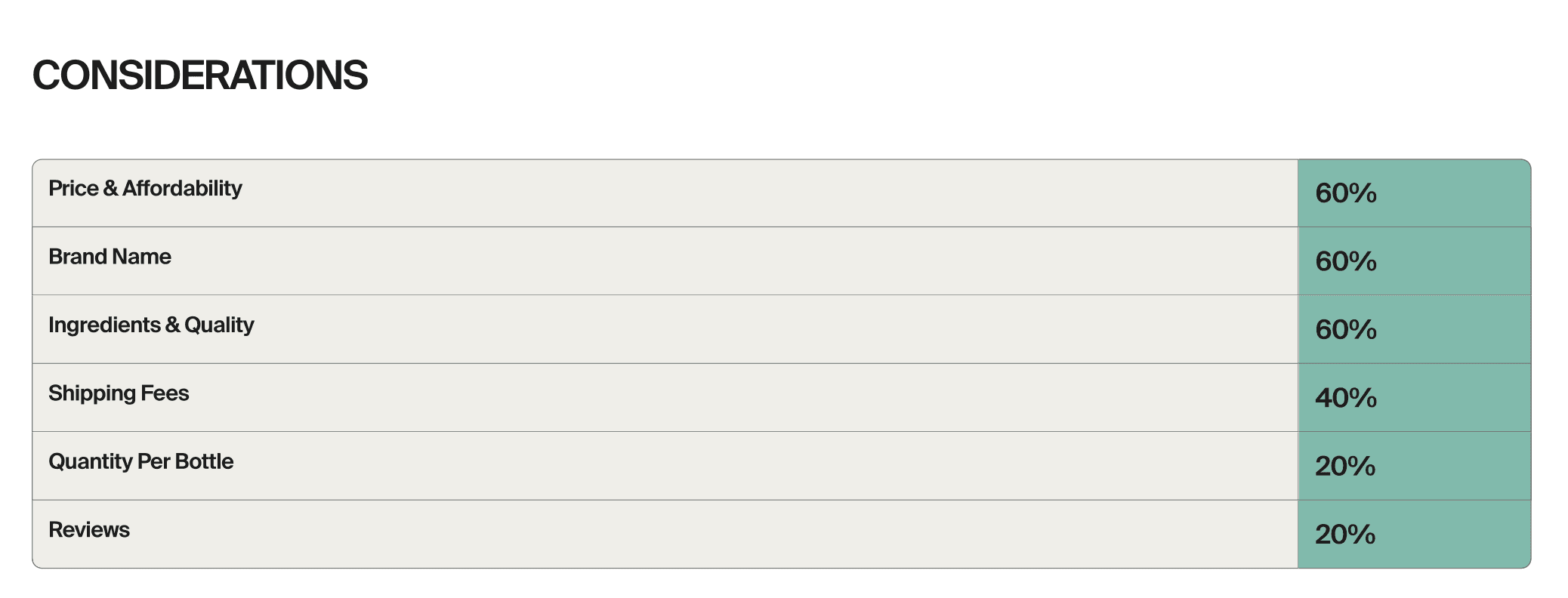
Learnings
The value of rapid low-fidelity testing via prototyping or other tools before committing engineering resources to full builds
30-day iteration cycles taught me about designing redesigns for real usage data rather than assumption.